Analyze Data
Tier0 adopts Marimo Notebook for advanced data analysis with Python.
Creating Notebooks
- Log in to Tier0, and then select Notebook.
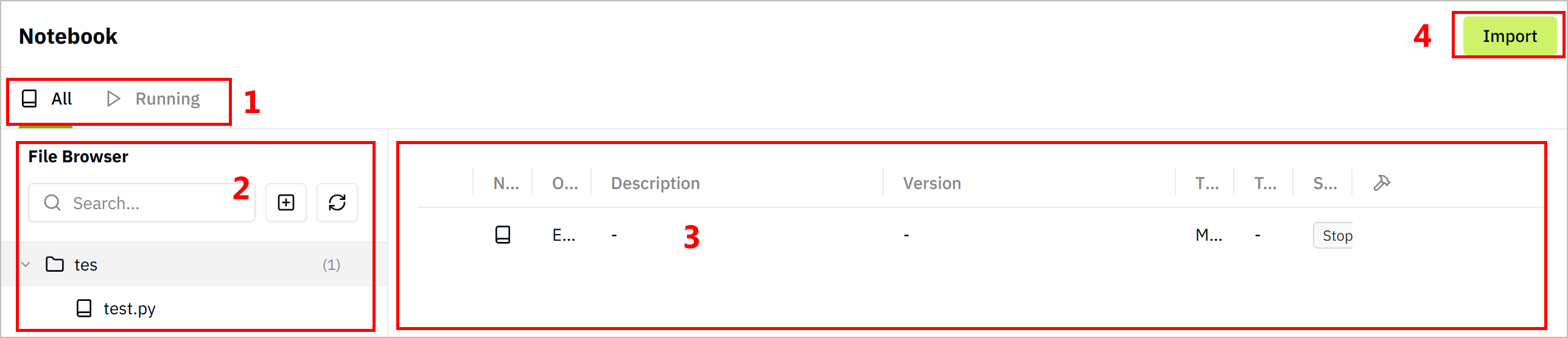
| No. | Item | Description |
|---|---|---|
| 1 | Category | Displays notebooks by their status. |
| 2 | Notebook Treemap | Lists notebooks in a folder-file hierarchical manner, you can add notebooks, refresh lists and search for notebooks. |
| 3 | Notebook List | Displays all notebooks of the selected folder in details. |
| 4 | Import | Import notebooks. |
- Select
 > New Folder.
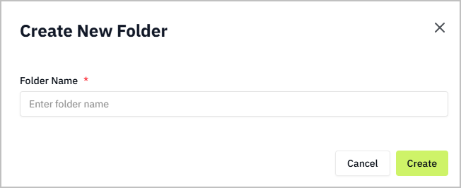
- Enter a folder name and click Create.
- Click the created folder, and then select > New Notebook.
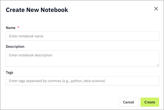
- Enter the notebook information and click Create.
- Click the created notebook on the right side, and start editing.
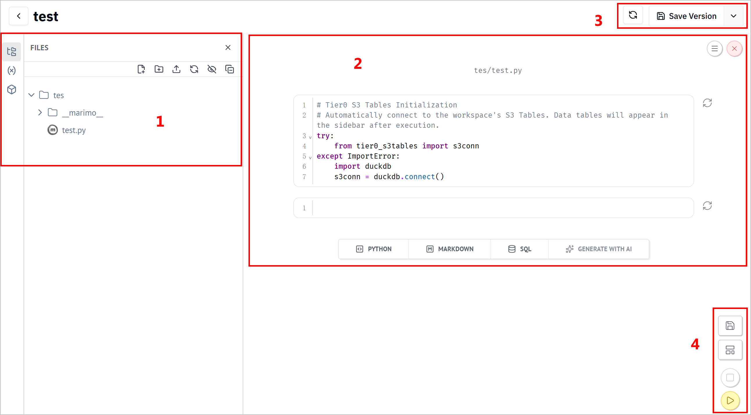
| No. | Item | Description |
|---|---|---|
| 1 | Modules | Displays notebook modules, including data sources and variables, dependency packages and AI bot. |
| 2 | Files | Displays notebook hierarchy. |
| 3 | Canvas | Displays cells and the corresponding results. You can select to create different types of cells, shutdown the notebook and change its settings. |
| 4 | Tool Bar | Refresh cells and save the notebook to different versions. |
| 5 | Notebook Operations | Save the notebook. Switch the current viewer style between cells & result, and pure result. Stop/run all cells. |
| 6 | Developer Mode | Enter developer panel, and set runtime activity. |
| 7 | Status | Displays the memory, CPU and AI status. |
Using Notebook to Run SQL Queries
Know Before you start
Data stored in database from UNS acts as an existing data source in notebook.
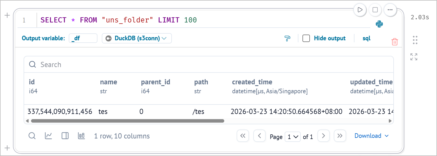
- Log in to Tier0, and then select Notebook.
- Create a notebook and access it, Click VARIABLES on the left side.
- Find the table you need on the left, click
 next to the table name to generate SQL statements automatically.
- Click
 at the lower-right corner to run all cells and view the query result.
tip
- You can click
 under DATA SOURCES on the left to add sources as needed.
 - Certain packages might be missing while working with notebook. In this case, click Manage packages on the left to install.
- (optional) Click SQL to add a new cell, and then select a connected database to run SQL statements.
Using Notebook to Analyze Data
Example Background
- Data source is temperature and humidity data of a device collected from a factory and sent to Tier0 UNS.
- Analysis on the data includes set risk thresholds, recognize risks according to combined temperature and humidity data, and generate tables, charts for easy view.
Steps
- Log in to Tier0, and then select Notebook.
- Create a notebook, inside it add the following cells.
- Cell 1: Import libraries.
import marimo as mo
import pandas as pd
import altair as alt
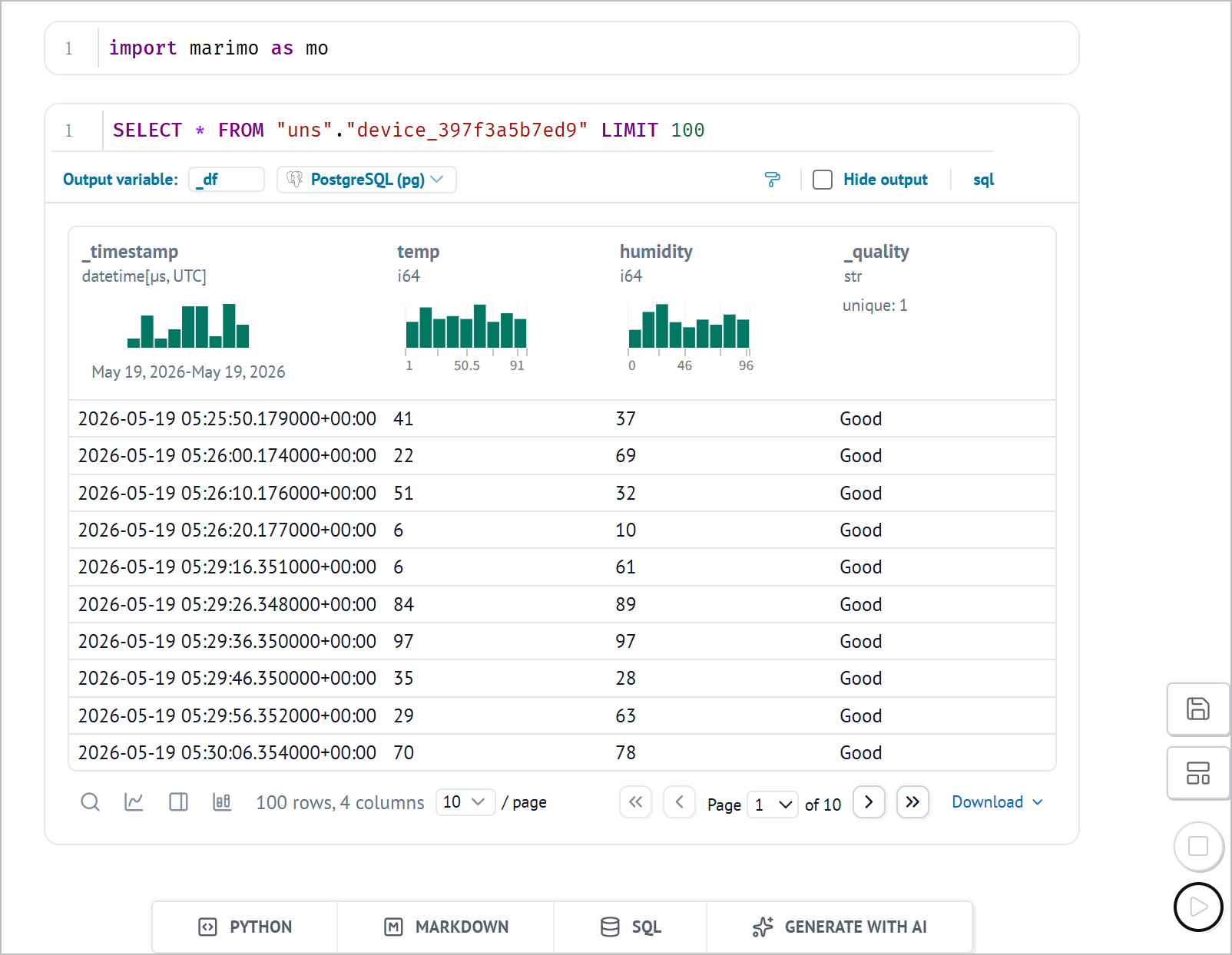
- Cell 2: Query data from the database
SELECT * FROM "uns"."device_15d9d69fd5eb" LIMIT 100
- Cell 3: Clean data
# Convert SQL result to pandas DataFrame
if hasattr(device_df, "to_pandas"):
    df = device_df.to_pandas()
elif hasattr(device_df, "to_dicts"):
    df = pd.DataFrame(device_df.to_dicts())
else:
    df = pd.DataFrame(device_df)

# Clean and normalize data
df["_timestamp"] = pd.to_datetime(df["_timestamp"])
df = df.sort_values("_timestamp").reset_index(drop=True)

df["temp"] = pd.to_numeric(df["temp"], errors="coerce")
df["humidity"] = pd.to_numeric(df["humidity"], errors="coerce")

df = df.dropna(subset=["temp", "humidity"])

df.head()
- Cell 4: Set risk thresholds and generate risk status fields.
temp_warning = mo.ui.slider(
    start=0,
    stop=100,
    value=70,
    label="Temperature warning threshold",
)

temp_critical = mo.ui.slider(
    start=0,
    stop=100,
    value=85,
    label="Temperature critical threshold",
)

humidity_warning = mo.ui.slider(
    start=0,
    stop=100,
    value=70,
    label="Humidity warning threshold",
)

humidity_critical = mo.ui.slider(
    start=0,
    stop=100,
    value=85,
    label="Humidity critical threshold",
)

mo.vstack([
    mo.md("## Threshold Settings"),
    mo.hstack([temp_warning, temp_critical]),
    mo.hstack([humidity_warning, humidity_critical]),
])
- Cell 5: Generates a table with risk status and anomaly status based on the thresholds set in Cell 4.
analyzed_df = df.copy()

def classify_risk(row):
    temp = row["temp"]
    humidity = row["humidity"]

    temp_high = temp >= temp_warning.value
    temp_critical_high = temp >= temp_critical.value

    humidity_high = humidity >= humidity_warning.value
    humidity_critical_high = humidity >= humidity_critical.value

    if temp_critical_high and humidity_critical_high:
        return "Critical: High temp + high humidity"
    elif temp_critical_high:
        return "Critical: High temperature"
    elif humidity_critical_high:
        return "Critical: High humidity"
    elif temp_high and humidity_high:
        return "Warning: Combined risk"
    elif temp_high:
        return "Warning: Temperature risk"
    elif humidity_high:
        return "Warning: Humidity risk"
    else:
        return "Normal"

analyzed_df["risk_status"] = analyzed_df.apply(classify_risk, axis=1)

analyzed_df["is_anomaly"] = analyzed_df["risk_status"] != "Normal"

analyzed_df.head()
- Cell 6: Generates anomaly summary statistics
total_count = len(analyzed_df)
anomaly_count = analyzed_df["is_anomaly"].sum()
normal_count = total_count - anomaly_count
anomaly_rate = anomaly_count / total_count * 100 if total_count > 0 else 0

critical_count = analyzed_df["risk_status"].str.startswith("Critical").sum()
warning_count = analyzed_df["risk_status"].str.startswith("Warning").sum()

mo.vstack([
    mo.md("## Joint Anomaly Detection Summary"),
    mo.hstack([
        mo.stat(label="Total Records", value=f"{total_count}"),
        mo.stat(label="Normal Records", value=f"{normal_count}"),
        mo.stat(label="Warning Records", value=f"{warning_count}"),
        mo.stat(label="Critical Records", value=f"{critical_count}"),
        mo.stat(label="Anomaly Rate", value=f"{anomaly_rate:.1f}%"),
    ])
])
- Cell 7: Generates a bar chart to show the distribution of different risk statuses.
risk_summary = (
    analyzed_df
    .groupby("risk_status")
    .size()
    .reset_index(name="count")
    .sort_values("count", ascending=False)
)

risk_bar_chart = alt.Chart(risk_summary).mark_bar().encode(
    x=alt.X("count:Q", title="Record Count"),
    y=alt.Y("risk_status:N", sort="-x", title="Risk Status"),
    tooltip=["risk_status", "count"]
).properties(
    title="Risk Status Distribution",
    width=700,
    height=300
)

risk_bar_chart
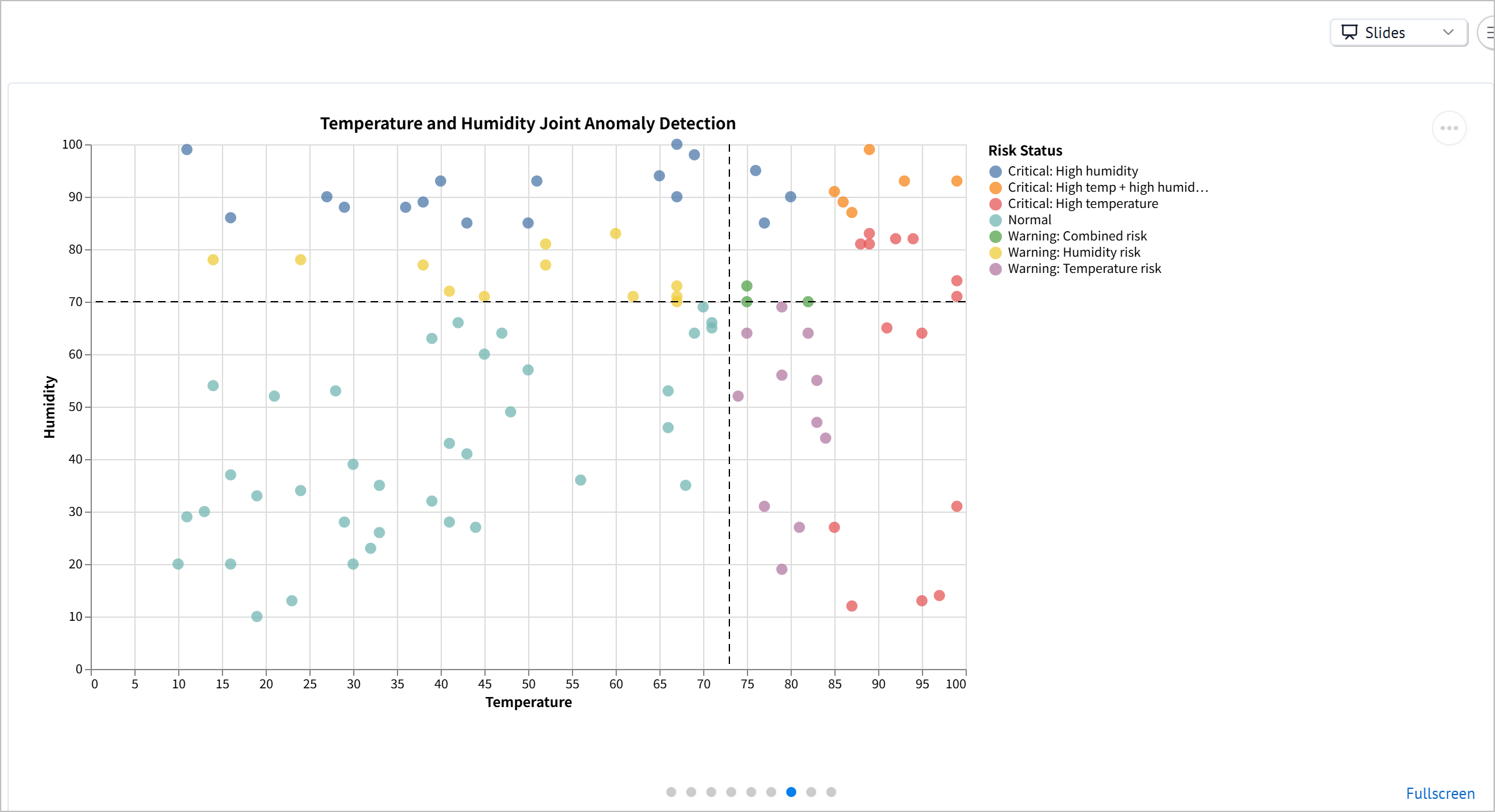
- Cell 8: Generates a scatter chart to show the relationship between temperature and humidity, with points colored by risk status.
scatter_chart = alt.Chart(analyzed_df).mark_circle(size=80, opacity=0.75).encode(
    x=alt.X("temp:Q", title="Temperature"),
    y=alt.Y("humidity:Q", title="Humidity"),
    color=alt.Color("risk_status:N", title="Risk Status"),
    tooltip=[
        alt.Tooltip("_timestamp:T", title="Timestamp"),
        alt.Tooltip("temp:Q", title="Temperature"),
        alt.Tooltip("humidity:Q", title="Humidity"),
        alt.Tooltip("risk_status:N", title="Risk Status"),
    ],
).properties(
    title="Temperature and Humidity Joint Anomaly Detection",
    width=700,
    height=420,
)

temp_warning_line = alt.Chart(pd.DataFrame({"x": [temp_warning.value]})).mark_rule(
    strokeDash=[6, 4]
).encode(
    x="x:Q"
)

humidity_warning_line = alt.Chart(pd.DataFrame({"y": [humidity_warning.value]})).mark_rule(
    strokeDash=[6, 4]
).encode(
    y="y:Q"
)

scatter_chart + temp_warning_line + humidity_warning_line
- Cell 9: Generates a table to show the details of anomaly records.
anomaly_df = analyzed_df[analyzed_df["is_anomaly"]].copy()

anomaly_df = anomaly_df[
    ["_timestamp", "temp", "humidity", "risk_status"]
].sort_values("_timestamp")

mo.vstack([
    mo.md("## Anomaly Details"),
    mo.md(f"Detected **{len(anomaly_df)}** abnormal records based on the current thresholds."),
    mo.ui.table(anomaly_df, page_size=10),
])
- Cell 10: Generates a summary of the analysis conclusion.
most_common_risk = (
    risk_summary.iloc[0]["risk_status"]
    if len(risk_summary) > 0
    else "N/A"
)

mo.md(f"""
## Analysis Conclusion

Based on the current threshold settings:

- Total records analyzed: **{total_count}**
- Abnormal records detected: **{anomaly_count}**
- Overall anomaly rate: **{anomaly_rate:.1f}%**
- Warning records: **{warning_count}**
- Critical records: **{critical_count}**
- Most common status: **{most_common_risk}**

This analysis uses both temperature and humidity to identify equipment environment risks.
Compared with single-threshold monitoring, joint anomaly detection can better identify combined environmental risks, such as high temperature and high humidity occurring at the same time.
""")
- Click at the lower-right corner to run all cells and view the results.
tip
Change the view style at the upper-right corner among Vertical, Grid and Slides.